When it comes to a real estate logo, you need to make sure your design is ready to stand up to the competition. So many logos wind up looking like the cliche rooftop or they don’t use a logo at all. Instead of going generic, check out these tips that will help you design a real estate logo that is both unique and effective.
1. Experiment with colors
When it comes to choosing the best colors for your logo, going with your favorite color is not the route to go. We also suggest staying away from the color combos you typically see in real estate logos like blue or green. The sweet spot is to choose colors is that best communicate your brand’s values and attributes. 
Source Icon Visual Marketing
When looking to exude professionalism, blue, black, silver, and gold are typically used. The warmer colors like orange and yellow are associated with positivity, friendliness, and happiness and work well as accent colors. In the end, your job is to make your clients happy by finding them the home of their dreams, so using the emotional connection these colors create just makes sense.
Here are some tips for choosing colors for your real estate logo:
- Stick to 2 or 3 colors: You want to keep it simple. Also, assuming you plan on using your logo all over the place (flyers, ads etc.) You are looking at very high printing costs for anything over 3 colors.
- Give thought to where you will be using your real estate logo: The real estate signage is the one place most people will catch your logo. For this reason, you want to make sure the colors you go with show up well on the signage. You want to have your logo “pop” in order to catch the eye of people driving by.
- If possible, you want to be able to convert your logo to black and white. This is helpful if you plan on doing newspaper ads or having your logo added to something like a t-shirt. Some colors like purple and green don’t convert to black and white very well.
2. Consider creating a wordmark
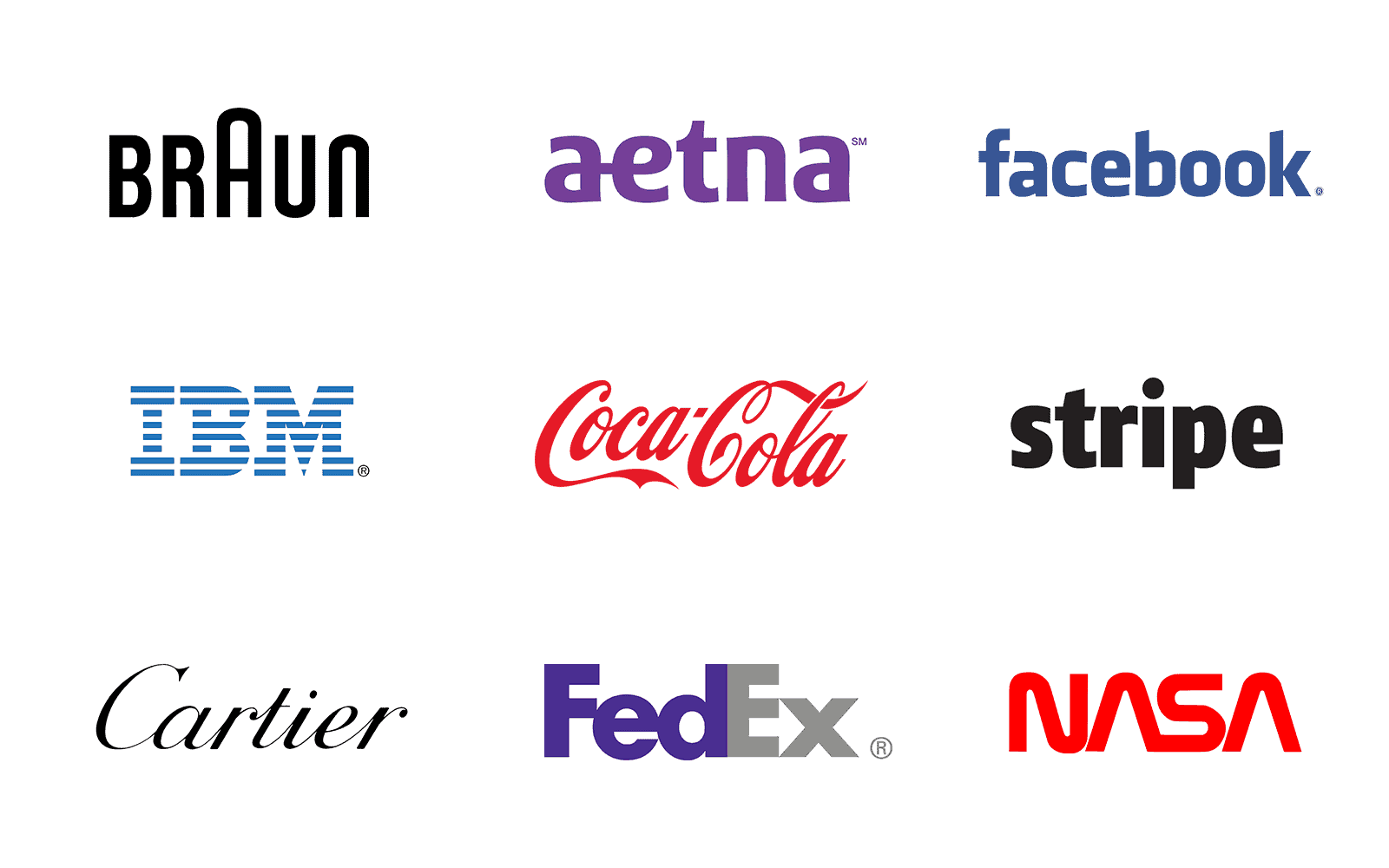
A great way to make your logo memorable is to use your company name as the logo. This is called a “wordmark.” Using this type of logo will go a long way in helping people remember your name. This is especially helpful since people will not always have your business card handy. Just look at these examples. All very recognizable wordmarks.

If a former client wants to refer a friend or family member, which real estate company do you think they’ll remember?
Here are some things to keep in mind when creating a wordmark:
- Choose a typeface: Come up with some adjectives that best describe your business (trustworthy, reliable). Next, look at the different fonts and see which fit best with those adjectives.
- Try adding in a character feature: Add a character feature to your wordmark to create a memorable logo that can stand out from the crowd. The exaggerated A in the Braun logo is a good example.

Use a pop of color: Since your logo is all text, adding in a pop of color will draw the eye in and help your brand stand out.
3. Add in local elements or icons

Using an icon or symbol is a great way to show what industry you are in. When it comes to real estate logos, many agents us generic rooftops and houses. These are overused most times and it would be more effective to use images that are related to the area you serve.

